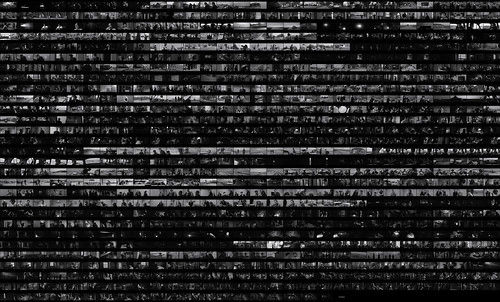
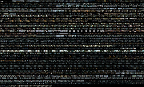
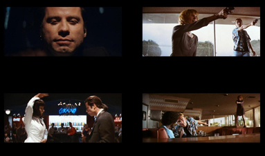
Figure 1: selected shots from Capote (left) and In Cold Blood (right).
Interdisciplinary Digital Media Studio is a class in the IDS program in The School of Visual Arts (SoVA) at Penn State in which students are introduced to methodologies and conceptual approaches of media design. For the class, I taught them how to research and develop design presentations with the implementation of data analytics for moving images and texts.
One of the assignments consisted in analyzing the films Capote (2005) directed by Bennett Miller and In Cold Blood (1967) directed by Richard Brooks in relation to their corresponding books, Capote by Gerald Clarke and In Cold Blood by Truman Capote. We viewed the films in class, and read, both, the novel and the biography. The class then analyzed the respective books by doing word searches, analysis of specific passages, and creative approaches by the respective authors, to then evaluate those searches in relation to the films. For the films I provided montage visualizations, which are selected screen shots representative of all the scenes (figures 2 and 3).
Figure 2: Visualization of the film In Cold Blood (1967). Click for a larger image.
The students were free to use the film visualizations and the data-mining of the texts according to their interests. Some of the options I suggested, but which were certainly not the only possibilities, included: times names or any other terms were mentioned, difference in the way particular moments appeared in the films and the books, and which parts were omitted.
Figure 3: Visualization of the film Capote (2005). Click for a larger image.
The students had to design an infographic, or a similar form of visual design that presented their findings in an easy to understand format. The students had to also write an assessment of their findings. What follows are selected projects which I consider successful for elements that I explain for each case. All my students worked very hard on their visualizations, and ideally, I would like to show all of their projects, but for the purpose of this post, I selected designs that show unexpected or experimental approaches in the implementation of analytics to find possible answers to diverse questions on the same subject. The samples that follow are successful in some ways, while having shortcomings in others.
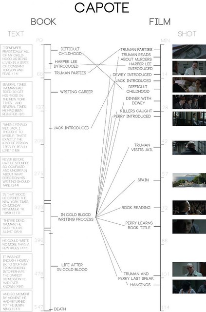
Figure 4: Visualization of common elements between Capote, the book and its respective film adaptation, by Michael Regan. Click image for larger file.
Michael Regan looked at commonalities and differences in Capote the book and film. In this regard he writes:
The focus and content of my infographic is in the arrangement of common elements between a book and its film adaptation. This is a very relevant way of viewing the comparison of two media representations of the same content. It is very interesting to view how differently the film creators had to move content to best adapt the form. The In Cold Blood film rearranges everything from the book into a different order to better fit a film format, while the Capote film takes most of its content entirely from one section of the book. These are two ways of adapting a book into a film, and looking at the infographics allows a very quickly visual way of understanding these techniques. It also shows the way that the books are constructed in the first place. The In Cold Blood book shifts back and forth often among the murderers, the victims and townspeople of Holcomb, and the investigation. This helps to explain the switching back and forth of elements and their ordering between the film and the book. This is contrasted by the writing style of the Capote biography. The small relative amount of time the book spends on the In Cold Blood writing process, as shown by the infographic, shows the focus of Gerald Clarke, the author. He chooses to explore the entirety of Capote’s life, without giving an undue amount of attention or priority to the In Cold Blood part of his life, however sensational a time it may have been.
Regan’s visualization represents the emphasis of the film on particular aspects of the book, and where they may or may not overlap. One can get a decent sense of the adaptation process, and to some degree, assess how such process is enacted in the particular production. His visualization is indexical, meaning that it allows the user to go to specific areas that Regan evaluates are important to the process of adaption from book to film.
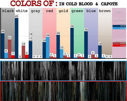
Figure 5: Visualization of color mentioned in the two films and books analyzed in class by Drew Heo. Click image for larger file.
Drew Heo decided to focus on the role color played in the films and the books. In his assessment paper he writes:
Color is a visual component, and Truman’s novel and biography are black and white on paper. Due to the two differing mediums, it’s only fair to allow both works to shine in the fields they are best in. The bar graph is a visual indicator of the specific mentions of colors in the texts of both books, as well as the amount of times a color is verbally spoken in the films. As expected, the films fall short when compared to the writings, as color is a visual thing and not used as much in speech. In order to compensate for the lack of mentions, below the graph is a condensed form of the colors present in both films in a “Movie Barcode” format, which has become recently popular on the internet for analyzing films.
To consider how color plays a role in the film is a unique question certainly worth pursuing. The accuracy of the numbers do need to be double checked, but what is worth noting here is his particular approach to evaluate a concept across media that is not easy to quantify. If anything, his focus and approach demonstrate a potential for more in-depth analysis of details shared across works that are adapted and crossover relevant productions that are often compared, but hardly ever analyzed quantitatively.
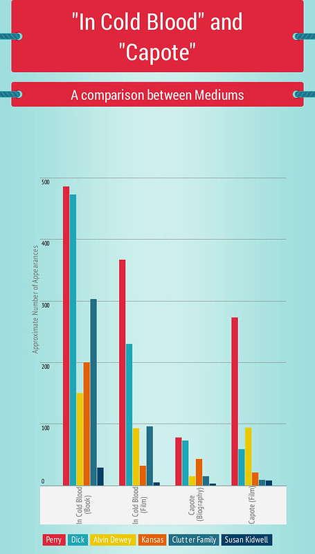
Figure 6: Recursion of characters in the biography, novel, and respective film adaptions, by Ethan Jones. Click image for larger file.
Ethan Jones focused on the number of times the names of particular characters appeared in the text, and the number of times each character appeared in the film. He writes:
There was a decision early on to reduce the commonalities between all four works by omitting what was exclusive to one story or the other. For example, the Truman Capote character is omitted because of his lack of presence in the In Cold Blood story (book and film). On the other side of that, minor characters from In Cold Blood (book and film) were discarded because of their lack of involvement in the Capote biography. Several characters remain constant, such as Perry, Dick, Alvin Dewey, Susan Kidwell, and the Clutter family. Simply looking upon the amount of times a given character was mentioned proved to be sufficient.
With Jones’s barchart we can evaluate how the characters are at play in all four works. One thing to note is that he counts the appearances of a character in the respective films every 5 frames. This, however, is dependent on the selective shots I provided, so the number of times a character may actually appear is not related to every five frames from the actual film but frames based on my selection of shots representing each scene. Nevertheless, the chart does provide a general idea of the prevalence of the characters in the respective publications and films. This can be cross-examined with the analysis of other students which is not included in this entry.
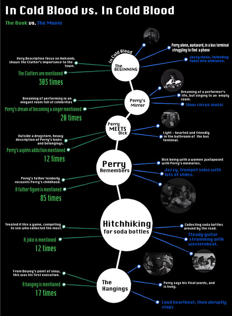
Figure 7: Analysis of parts of the book and film where dialogue did not play a major role, by Nikki Tatsumi. Click image for larger file.
Tatsumi focuses on parts that had next to no dialogue in both the film and the book, In Cold Blood, she writes:
For this project I focused on the parts of the movies and books where dialogue did not play a major part in the creation of the scene. This was most relevant in the book In Cold Blood. This book, borderlining a research novel, was beyond descriptive. Its specificity allowed the reader to truly identify and imagine these people to the point of skin color, body language, tattoos and countless other tidbits that Capote decided to include. If not enough, Capote’s rendition of each character’s backstory also helps to fuel the reader’s imagination. It is through these scenes that I think Capote is the most successful. Though dialogue gives a character a voice, Capote was able to utilize his research and observations to create characters who did not need one. By their mannerisms alone, Capote could write this whole story. But when these heavily described sections of the book meld with the movie. Directors used the score to help make up for lost information through the text. In Cold Blood and its movie, had
the best transition.
In the movie version, heavy use of jazz influenced music helped to create the mood. It was a lot more foreboding due to the the choice of score. It was the type of music that was not soothing or collected, it was erratic and soft at times, loud and uneasy at others, as if the viewer did not expect what was next. The scenes that this score was utilized really well were the juxtaposed part of Perry’s past and the beginning scene with Perry at the bus terminal. They utilize the uneasy jazz to mirror Perry’s
feelings at both times.
In Tatsumi’s design we can note that she was selective of which parts to feature, as there were many more moments and passages in both the book and the film that would fit the subject of her research. In this case, we can consider her focus and design similarly to Heo’s, with potential for more in-depth exploration. Her focus also shows how analytics, while at times may be presented to be objective in what the results may be, are actually informed with particular questions and interests that drive the research. This is something that individuals using quantitative tools need to be more honest about, and not claim that what they found is entirely “objective.” Tatsumi’s focus is unique in that she focuses on moments in which dialogue did not play a major role. No other student considered this, and I never would have thought of this focus. In this sense her research points to an aspect of the film that could be very interesting to further analyze.
One thing that I should note is that her design could be much better. However, given that many of the students were dealing with multiple elements of creativity and research I did not push her to redesign her presentation given that she had touched on an interesting aspect of both the film and the book that she could have explore more in-depth.
Figure 8: Diagram of biography, novel and both films by Megan Coren. She focused on similarities of the four works. Click image for larger file.
Megan Koren focused on the similarities of all four works. Similarly to Tatsumi, her diagram shows that she was rather selective. She writes:
The nature of my infographic does not show many of the differences between the books and films; rather, it shows the similarities of In Cold Blood and a follow-up comparison of how Capote visually paralleled this information. Because Capote was a secondary addition, I feel I provided a skewed representation of the biography. I included text from the book that aids the comparisons in my infographic, but Capote is not really about the novel In Cold Blood. It is about Truman Capote’s life, spanning childhood through adulthood. Although interviews with the Clutters cover only roughly 50 pages of the monstrous 547-page biography, the film diminishes this biographical time-line and completely focuses on Capote’s writing of the book. The film concentrates on the obsessive Truman himself, while shot-wise it accurately parallels the In Cold Blood film. We see the similarities between Capote and Perry and why Capote sympathized with him so strongly. Regardless of their different perspectives, I was genuinely impressed at how many connections the directors were able to make between scenes in the Capote and In Cold Blood movies.
This particular presentation is easy to read, and one is able to figure out how the four works are related according to Koren’s interest. However, it does have inaccuracies that are evident upon closer observation. for instance, the moment when Perry speaks on the public phone is not at 0 minutes of the film, but actually more or less around 10 minutes into the film. Koren should have spent more time with the films to evaluate their respective chronologies. If she did this her assessment, which is quoted above would be stronger. Her selection of passages from the books also lack a systematic approach, which makes one wonder why the citations were chosen over any others. In any case, Koren’s design shows potential in exploring formal aspects of presentation of a large amount of material. She needed to spend more time working on the accuracy of the data and information–her design, conceptually, shows potential, although it could be further polished for a more elegant read.
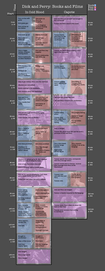
Figure 9: Visual analysis by Caleb Yoder of the names “Dick” and “Perry” in book publications Capote and In Cold Blood, and their respective film adaptations. Click image for larger file.
Caleb Yoder decided to be very specific in his analysis and focused just on the names of the two killers. He writes:
After data-mining information for Dick and Perry, I found that the books are often able to provide a lot more in terms of description for the characters. On page 325 of Capote, Clarke is able to give a thorough description of Perry’s appearance, personality, and childhood. The films need to rely on the actions of the characters or their conversations, and in some cases even flashbacks (like Perry’s multiple flashbacks to his childhood in the film version of In Cold Blood), in order to convey this information that the book lists off so easily. Film must also take some creative liberties with how the story functions visually–the book doesn’t describe every set piece, and so the film inevitably conveys some information independent of the book.
Both mediums make the most of their capabilities, though. The book In Cold Blood familiarizes us with the Clutter family in a way that the film fails to do (most likely due to time constraints). Our greater intimacy with the Clutter family and characters like Bobby Rupp in the book serves to make the Clutters’ deaths and the impact they have on the Holcomb community more salient to us. The film is also able to stir emotional responses through its use of music, composition, and the pacing of shots. A great example of this appears in both films when Perry is hanged at the end. The audio swells, Perry breathes heavily, and the intensity increases until the trapdoor opens abruptly.
Yoder’s is one of the most accurate analysis submitted. His focus on only two terms allowed him to develop a detailed visualization of the films and books. In turn, he is able to provide specific pages in the books and times in the films when particular moments take place, in which both Dick and Perry are prominent. This gives us a strong sense of how the stories of Dick, Perry, and Capote were intertwined in real life as well as in the semi-journalistic fiction created by Capote himself.
The visualizations presented here should be considered starting points for the future of analysis by designers. The students in my class eventually applied the methods and critical skills developed in this particular analysis to develop a research & design project of their own, which was the final assignment of class.
There is much to be said about each of the analyses covered here, as well as others. For instance, we can see how by using analytic tools with quantitative capabilities we are able to dissect the grammar of visual and textual languages to better understand their intersections. All of the projects in class, including those not featured here did show a decent balance in quantitative and qualitative analysis. The challenge for a few of the students as is evident in some of the examples part of this entry is to push further for accuracy in their results. This is a skill students keep working on as they move on with their studies.

