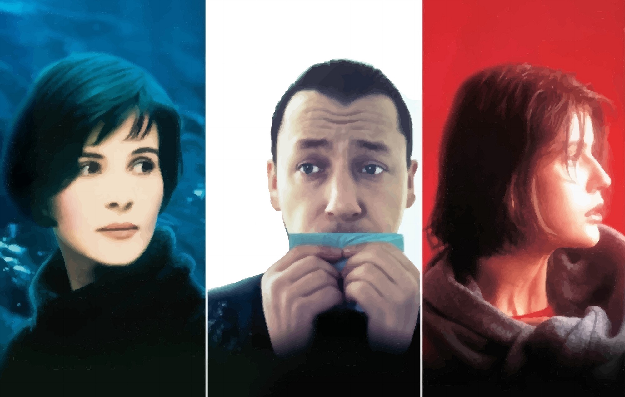
(Image 1): Cover art for The Three Colors Trilogy: Blue, White, Red, by Krzysztof Kie?lowski.
The following are the notes of my presentation at the Art and Design Research Incubator (ADRI), Penn State, which took place on October 17, 2017.
You can download the tutorials of the workshop:
The presentation was designed to provide a clear basic example of how to perform comparative image analysis. For this reason, the following content is not an in-depth analysis of the three films. However, my long term interest on the color trilogy by Krzysztof Kie?lowski may find its way to one of my essays in the future.
Introduction:
The basic principle of image-mining is to be able to analyze large amounts of data (in this case a series of images) and be able to evaluate how they are organized with the aim to understand their differences and similarities. This approach is applicable to any large amount of images, which could consist of a series of photographs in an archive, a large amount of digital images in a database, such as Flickr, or a video or film. In all of these cases the methods for evaluating the construction of meaning relies in the analysis of particular patterns that may be at play in the body of information.
Image-mining is quite similiar to text-mining when approaching both with the purpose to evaluate how meaning is constructed based on certains types of patterns; however, because we understand images by comparing elements within a composition, and texts by sequential organization known as sentences and paragraphs, the way each of these forms is analyzed is different. I will go over text-mining in another occasion; For now, let us engage directly with image analysis.
Principles of Image Analysis
The basic approach to image analysis begins with the examination of a single image. Once we understand how this takes place, we can then implement this basic principle to a series of images. There is a limitation to this process when we reach thousands of images. At such point, we can implement big data analytics to be able to view trends that may not be possible to perceive with careful visual inspection.
In this occasion, as an example, I will analyze The Three Colors Trilogy: Blue, White, Red, by Krzysztof Kie?lowski. His work is optimal to analyze given that he is credited for being a methodical filmmaker who is keen on detail.
The best approach to image-mining is to work with sample data, meaning one can select part of the information for analysis. This is common in statistics, as is well known. In this occasion, I will focus on the opening scenes of Kie?lowski’s trilogy in order to move through the basic stages of analysis:
As noted in my first workshop presentation at ADRI, the process of data visualization consists of four parts (which can be subdivided into more parts of course):
- Perform research based on a question (image, sound, text)
- Gather data
- Evaluate data
- Re/present the data (image, sound, text)
In order to get a more complete analysis of the films, we would inevitably need to analyze sound as well, but as already stated, the image is the focus in this occasion.
My basic question is “What are the similarities and differences among the three
films by Kie?lowski?” To engage with this question, I performed the following method:
- Choose subject (Trilogy Films) based on a question
- Define parameters for sampling (around 60 seconds of Opening scene)
- Evaluate (similarities/differences)
- Open to further research based on initial results
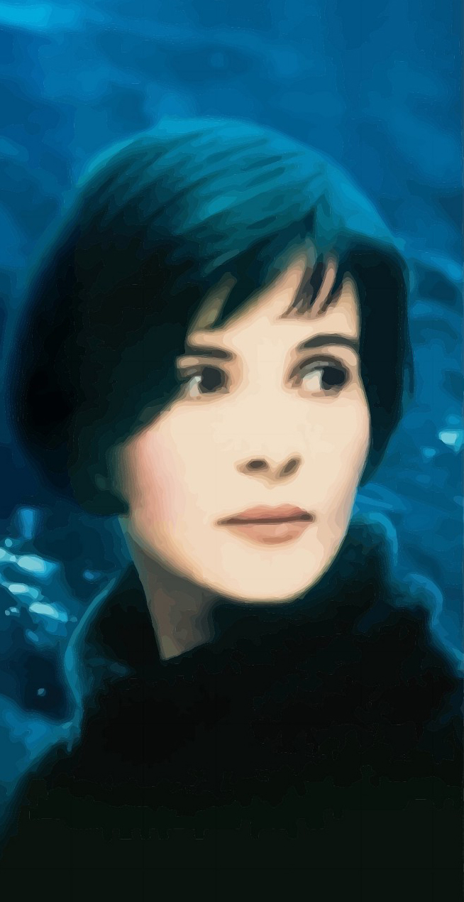
Image 2: Cover art of Blue.
Let’s begin by considering the first minute of the three films (not including opening credits). Blue, starring Juliette Binoche, was released in 1993. It focuses on Julie de Courcy, who must cope with life after the death in a car accident of her child and husband (music composer Patrice de Courcy).
(View Blue, opening scene)
The first minute of the opening scene shows the closeup of a moving car tire, then cutting to the film credits and title, then back to the tire, then cut to the hand of a child holding a piece of paper outside the back passenger window, then cuts to the child viewing the road from the read window while yawning, suggesting a sense of boredom. One gets a sense of time passing as the light has changed from day to night.
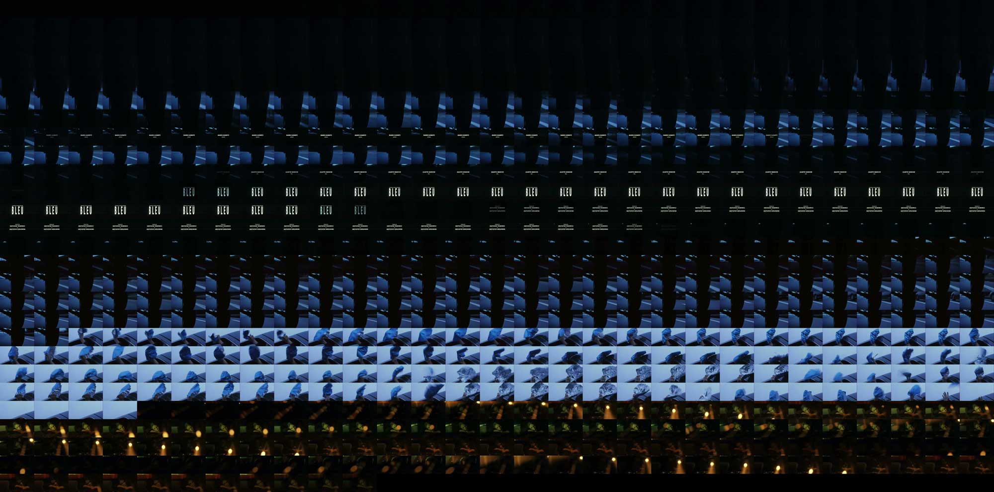
Image 3: Grid-montage of Blue.
This scene when extracted shows a somewhat clockwork rhythm as is evident in the grid montage visualization. (image 3)
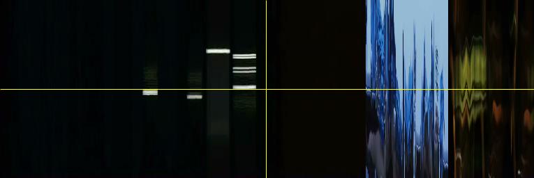
Image 4: YZ Slices of Blue.
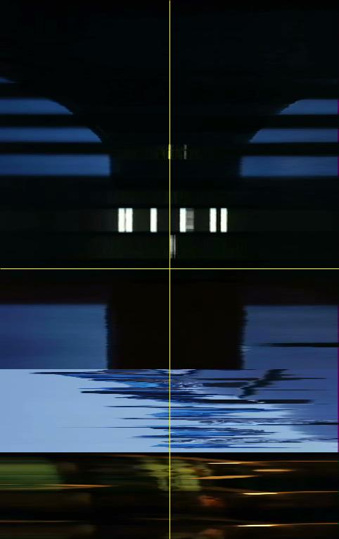
Image 5: XZ Slices of Blue.
Such pattern can also be noticed in the YZ and XZ sliced visualizations. (Images 4 and 5) The point of this analysis is to compare Kie?lowski’s trilogy, so before we look further into these three images, let us view the other two films and their basic visualizations.
Image 6: Cover art of White.
White, starring Zbigniew Zamachowski, and Julie Delpy, is the story of Karol Karol, a Polish immigrant married to a French woman (Delpy). (image 6) The story is about Karol’s struggle to regain his sense of being byway of revenge, after his divorce, and loss of French citizenship.
(View White, opening scene)
The first minute of White‘s opening scene shows a large suitcase on an airport carousel, the camera follows the suitcase upclose while the film credits and title fade up. It then cuts to a low mid-shot of a man walking swiftly from left to right. The camera follows the man and when he stops to look to his right (the viewers left), the camera moves up to his upper body. This is Karol, the main character who appears concerned.
Image 7: Grid-montage of White.
This scene when extracted also shows a somewhat clockwork rhythm which is also evident in both the grid montage (image 7) as well as the XZ and YZ slices (images 8 and 9).
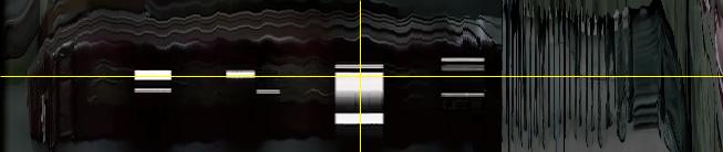
Image 8: YZ slices of White.
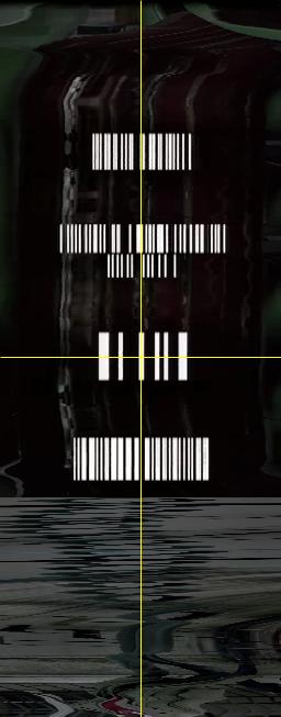
Image 9: XZ Slices of White.
Let us look at the opening scene of the last film of the trilogy.
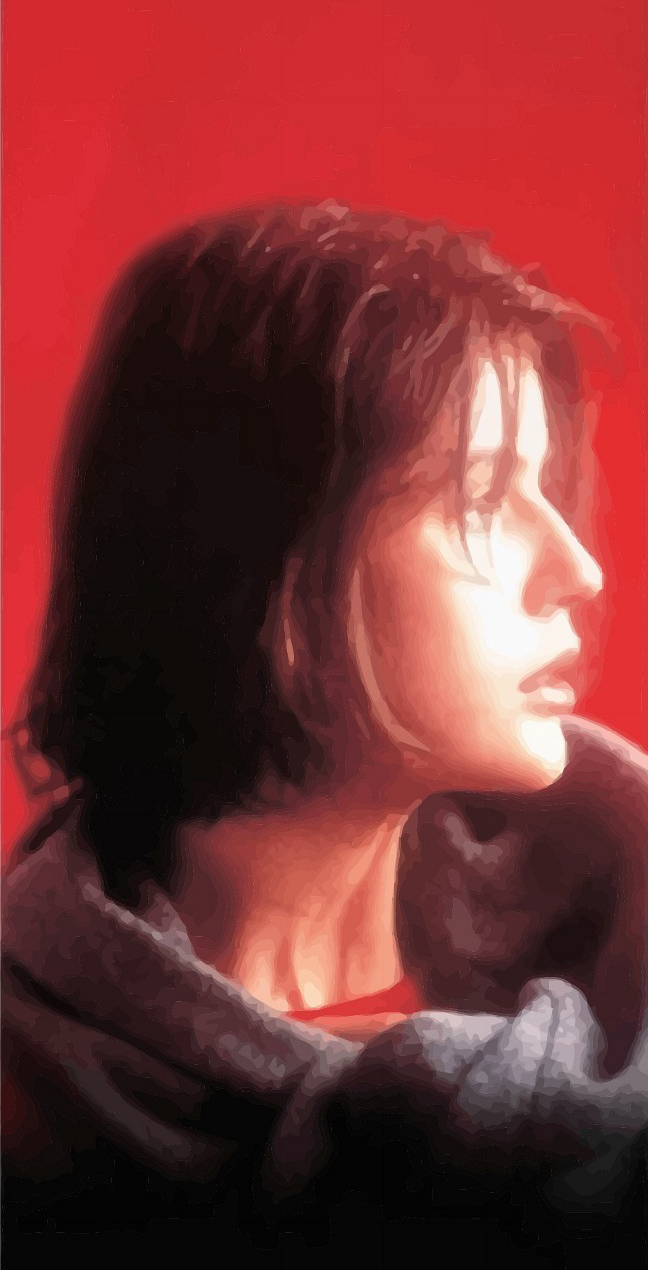
Image 10: Cover art of Red.
Red, starring Irène Jacob, is the story of Valentine Dussault, a college student who models part time. The film focuses on her relationship with a possesive boyfriend (who is only present on the phone), and a retired judge who owns a dog that runs astray, and is found by Valentine.
(View Red, opening scene)
The film opens with a close up of a phone. In the first minute, a man dials and we are immediately immersed in a tracking shot that takes us through all the phone cables across the ocean. In this case, the opening scene ends with the credits and title of the film.
Image 11: Grid-montage of Red.
While this opening may appear to be quite different from Blue’s and White’s, when viewing the grid montage (image 11) and the XZ and YZ slices (images 12 and 13), we notice that there appears to be a similar rhythm, although this may not appear to be the case, given the fast movement of the camera through the ocean and landscapes.
Image 12: YZ slices of Red.
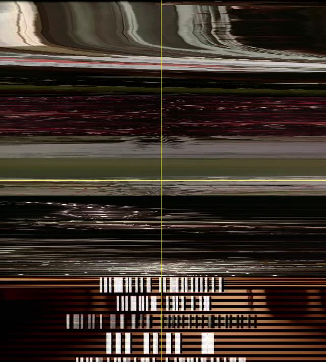
Image 13: YZ Slices of Red.
But what else can these images tell us? When we look at the three grid montage visualizations, (image 14) we notice that there are large sections with dark and light colors. They appear to be somewhat extreme in the visualizations, but this is not necessarily noticeable when viewing the actual films given that such changes are gradual. The overall colors of the films also appear to echo the title. Blue is predominantly blue, while White is quite dark, but certainly close to a whitesih/washed out greenish-gray value, and Red is predominantly red.
Image 14: Grid-montages of Blue, White, Red.
This is also confirmed with the XZ and YZ slices (images 15 and 16). However, a difference emerges when viewing these images. The film titles and credits appear at different moments. For Blue they briefly fade up around the middle, for White, they take much more of the opening shot, while for Red, they are at the end of the first sixty seconds. This difference may have taken place for many reasons, likely asthetic ones, which are unmeasurable. But what we can evaluate here is how these choices develop the uniqueness of the films, which are considered to be, by many critics, a complex body of work.
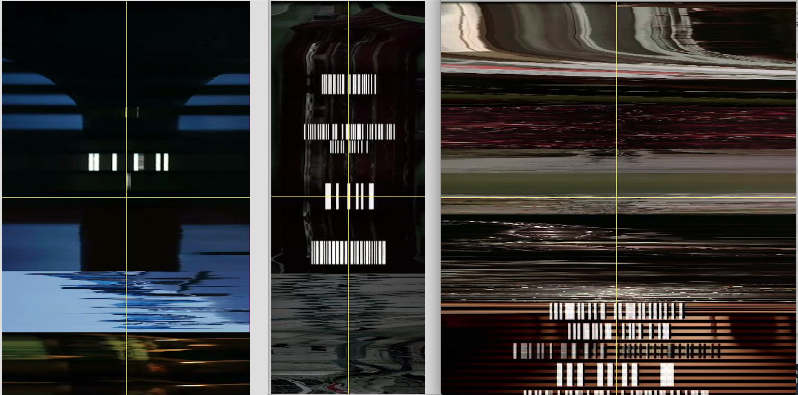
Image 15: XZ axis of the three films
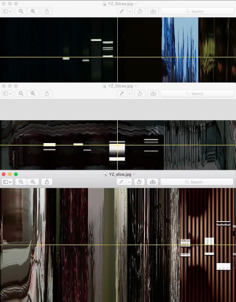
Image 16: YZ axis of the three films
Running other analyses, we can learn a bit more about the structure of the trilogy. We can stack the images to evaluate its average intensity, median, standard deviation, and sum slices (images 17 – 19).
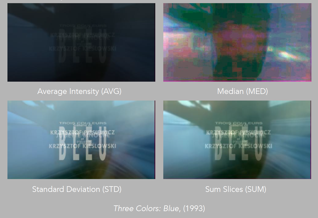
Image 17: Average Intensity, Median, Standard Deviation and Sum Slices of Blue.
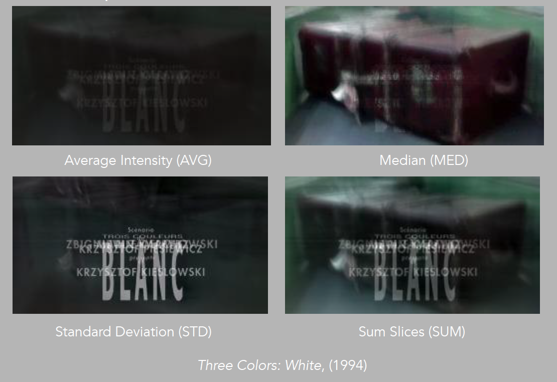
Image 18: Average Intensity, Median, Standard Deviation and Sum Slices of White.
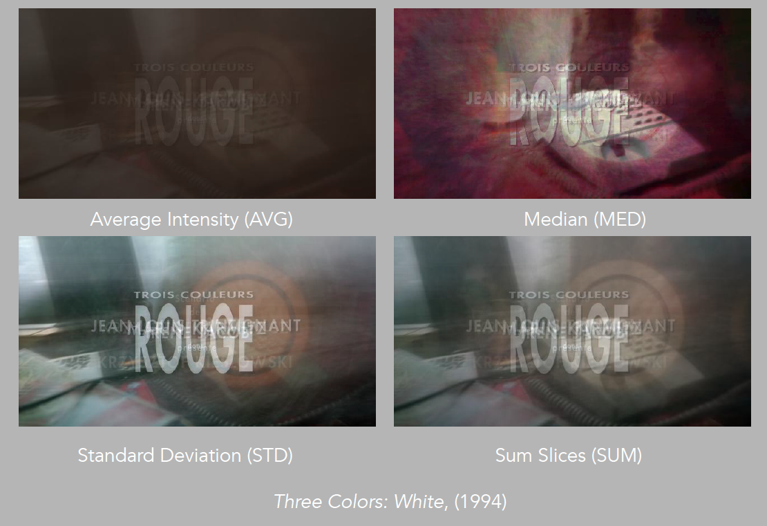
Image 19: Average Intensity, Median, Standard Deviation and Sum Slices of Red.
We can do this for all three films, and notice a few more variables (images 20 – 23). For one thing, the film titles are quite pronounced, also, an object of focus emerges in all three. For Blue it is the car tire, for White it is the suitcase, and for Red, it is the phone.
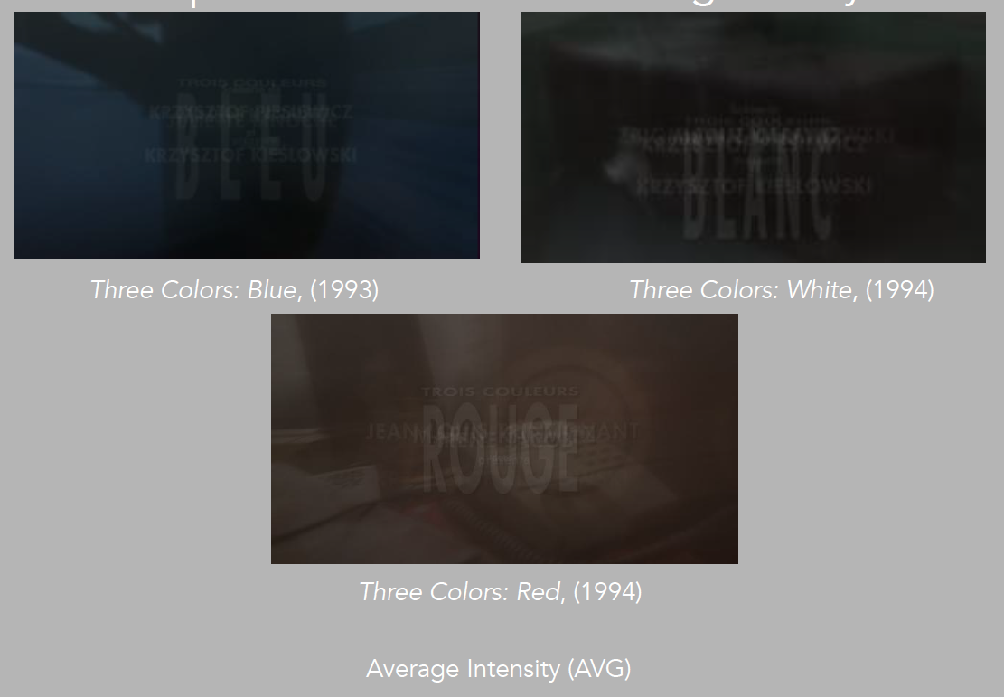
Image 20: Average Intensity of Blue, White and Red
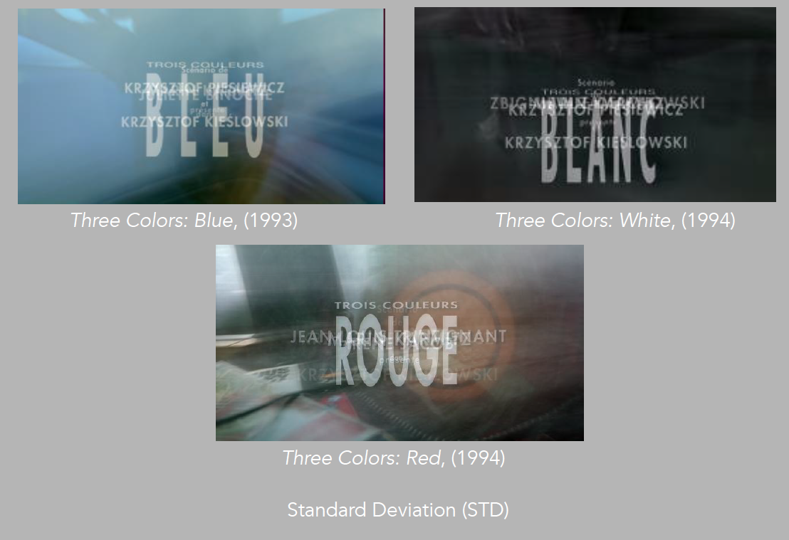
Image 21: Standard Deviation of Blue, White and Red

Image 22: Median of Blue, White and Red
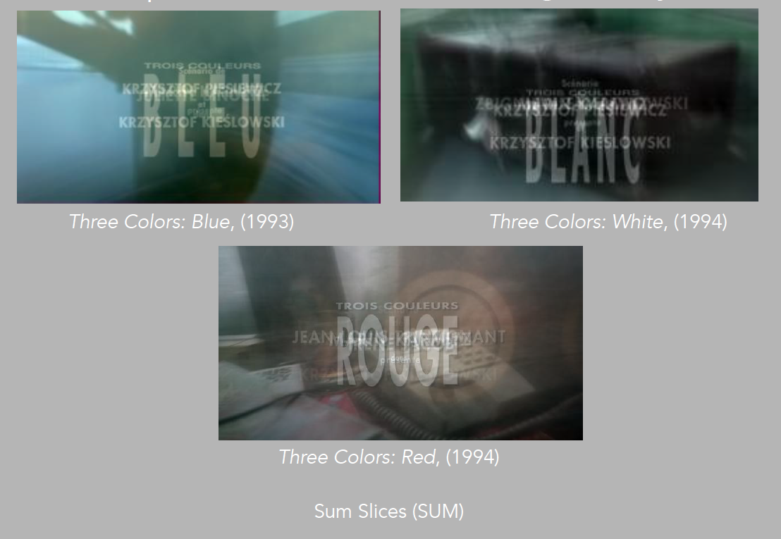
Image 23: Sum Slices of Blue, White and Red
None of these objects would have stood out as they do in the visualizations, when viewing the actual film, and in this case, they appear as visual tropes that foreshadow the drama that is to evolve. Here we can notice that Kie?lowski’s methodical approach and attention to detail is confirmed.
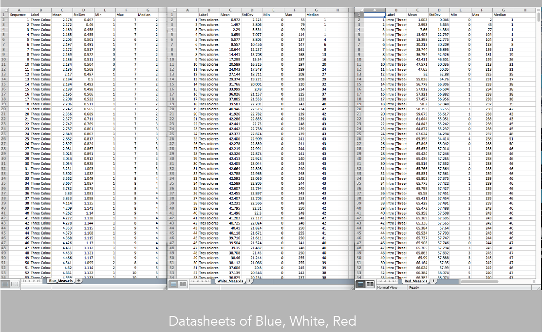
Image 24: Datasheets of Blue, White and Red
But we can do more. We could also extract data from the images, and evaluate their mean, median, standard deviation to evaluate precisely how each of the three patterns may be similar and different (image 24).
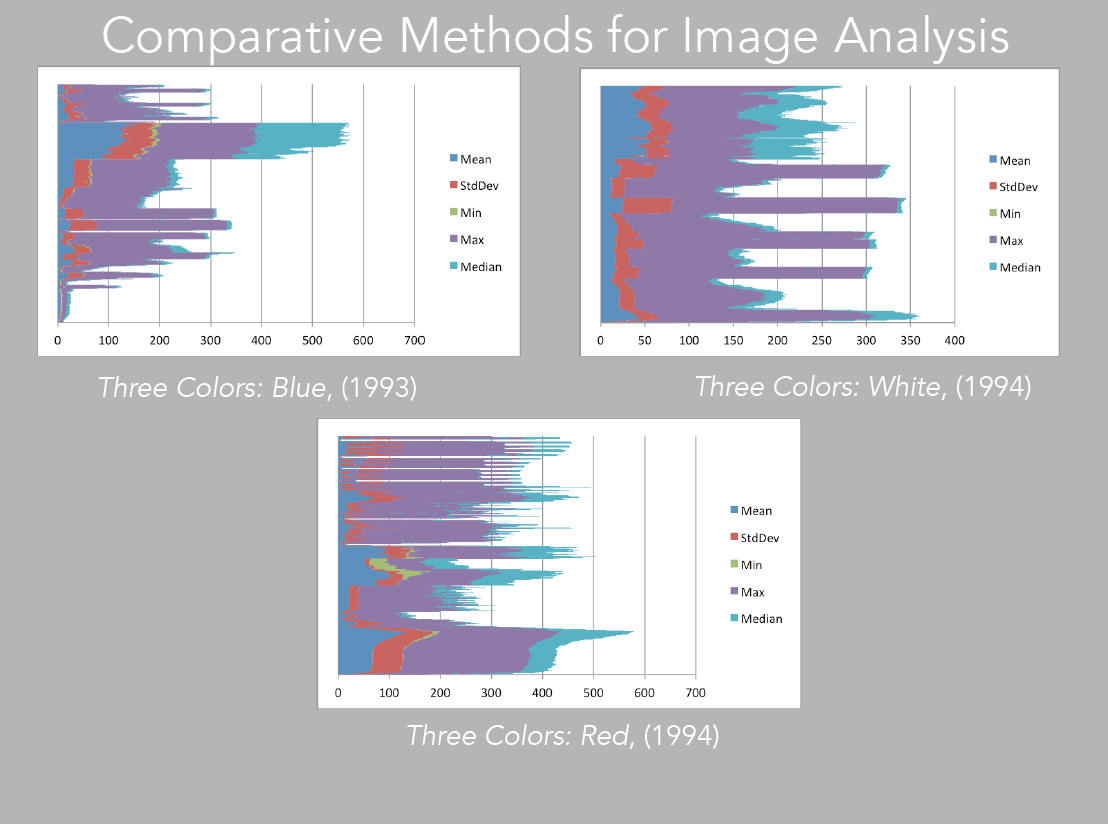
Image 25: bar charts of Blue, White, Red
We can then take this data and visualize it as basic barcharts, that as expected, will also echo the pattern one perceives in the XZ and YZ visualizations (image 25).
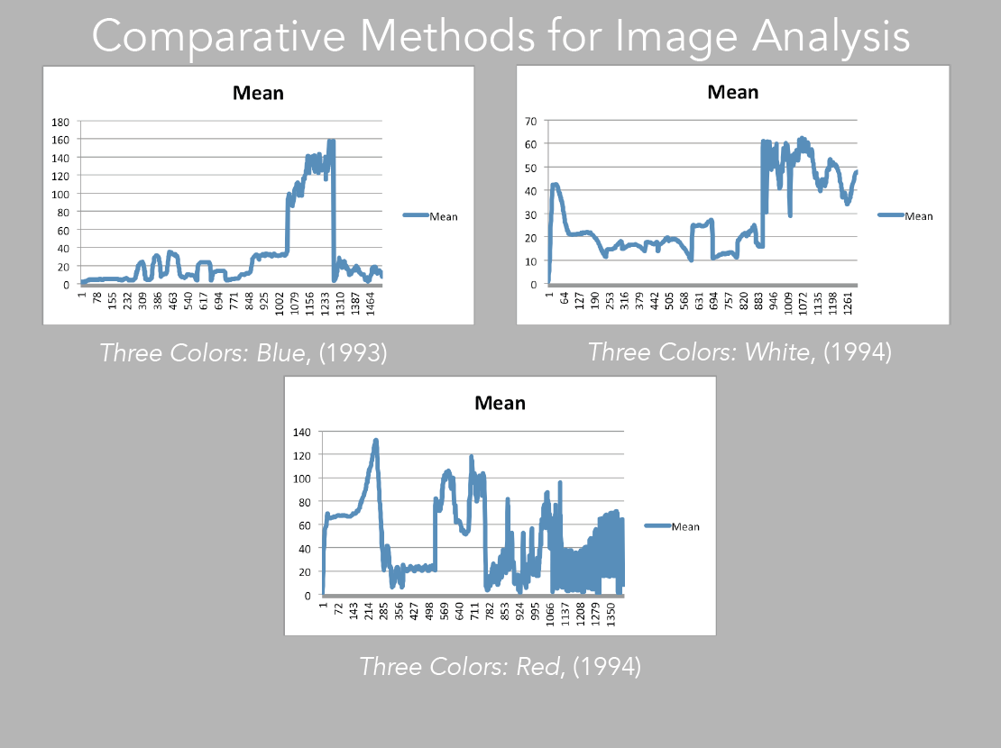
Image 26: Mean of Blue, White and Red
Sometimes, in order to evaluate patterns, it is best to choose one measurement at a time (image 26). For instance if we take the mean, which is basically the average of color, and compare it directly with the corresponding slices, we may better understand how the pattern is constructed in terms of color values, and how this comes to inform our experience of the moving image (images 27 – 29).
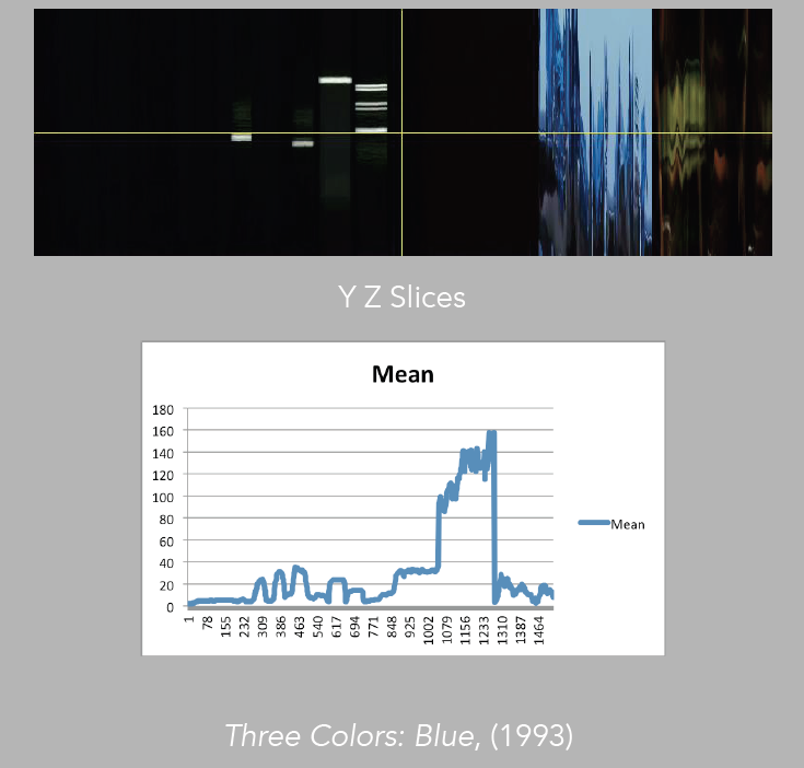
Image 27: Comparison of mean to YZ slices, Blue
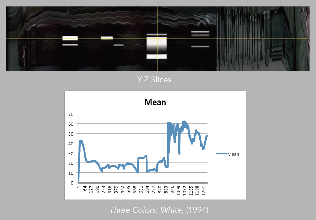
Image 28: Comparison of mean to YZ slices, White
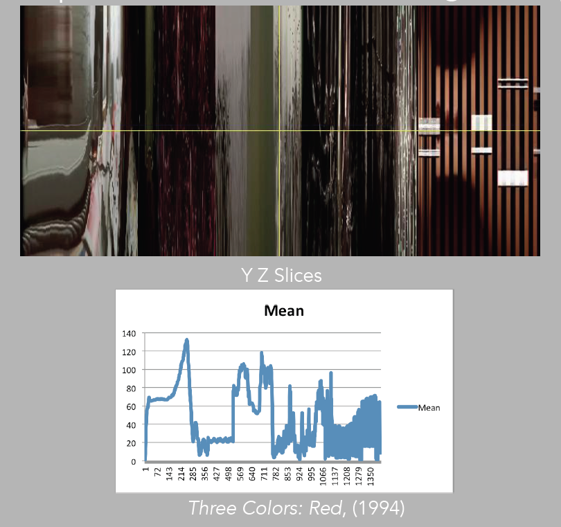
Image 29: Comparison of mean to YZ slices, Red
We could take the time to match the numbers in the datasheets to the frames and see how much variation there is in the similarity of the patterns, but in this occasion, a visual evaluation already exposes Kie?lowski’s aesthetics, of having the tendency to make visual changes at about the same time during the introduction of the three films. In all three cases, there is a shift from dark to light. Adding the math, of course, can be useful for accuracy in a more detailed analysis that would try to evaluate extensively the director’s creative approach.

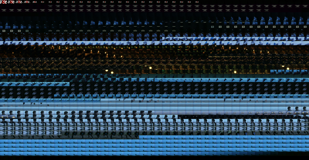
Image 30: Grid-montage of Blue‘s first 3 minutes
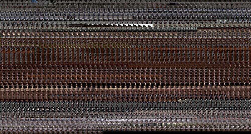
Image 31: Grid-montage of White‘s first 3 minutes
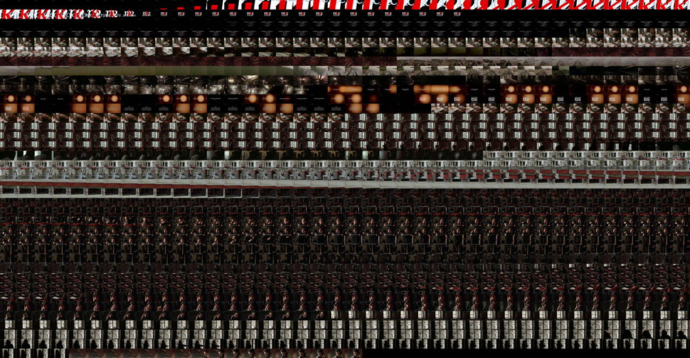
Image 32: Grid-montage of Red‘s first 3 minutes
The general take away from our analysis of the first sixty seconds of the films is that regardless of the elements that are part of the composition, all three films appear to juxtapose extreme lighting, which may not appear to be climactic in terms of the development of the story, but certainly function with the purpose to develop greater engagement with what is to come throughout the film. This relation of drastic light changes is even more evident if we also visualize the first three minutes of the films (images 30 – 32).
(Go over tutorial):
