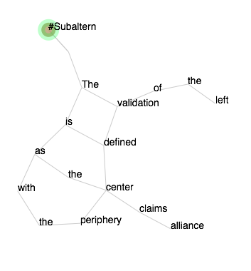
Figure 1: Eduardo Navas, #Subaltern, 2010 tweet rewritten as a poem, February 2015
Selected Poems in D3 Force Layout
2010:
#Nature || #Opinions || #Fatty || #Subaltern || #Migrants
2012:
#Modules || #Nano_specs || #Standards
2013:
#Abundance || #Plastic || #Universals || #Predominance
__________
During the month of January and February of 2015, I began to consider how to reconfigure selected tweets of my @poemita twitter account as poems. The first outcome of this process was three sets of image-layouts of selected poems from the years 2010-2013 which I called “Poem Portraits.” They are available on the main @Poemita project page:
Poem Portraits 2010
Poem Portraits 2012
Poem Portraits 2013
Simultaneously, I had been working with D3 to develop a force layout for visualizations of selected entries from my project Minima Moralia Redux (This set of visualizations will be discussed in a separate entry). Such layout is designed mainly to show the relevance of words within each of Adorno’s aphoristic essays. At one point in this process, it occurred to me that I could use D3 force layouts not only for research based visualizations, but as an actual medium to rewrite poems. Hence, I repurposed D3 features to develop a set of poems as shown in figures 1 – 4.
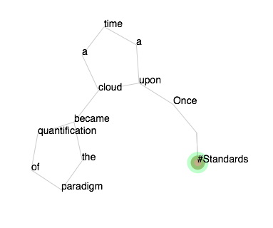
Figure 2: Eduardo Navas, #Standards, 2012 tweet rewritten as a poem, February 2015
Some of the poems I selected also are part of the Poem Portraits, but the interactivity that D3 offers led to a very different feel for each piece of writing. The basic premise behind the force layout poems is that each line of text should be connected to the line below it and above it, so that each poem could be read similarly to a print version. One can get a sense of this when comparing the D3 layouts to the Poem Portraits.
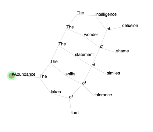
Figure 3: Eduardo Navas, #Abundance, 2013 tweet rewritten as a poem, February 2015
D3’s force feature allows for the words to push away from each other, and it is the lines that keep the words linked; otherwise they would float away randomly. These simple features offer unexpected results, which make the reading of the poems potentially different every time they are accessed. There is also a sense of discovery as the reader needs to figure out how the words are connected. Some poems are move ambiguous than others, and one could read the lines in different order.
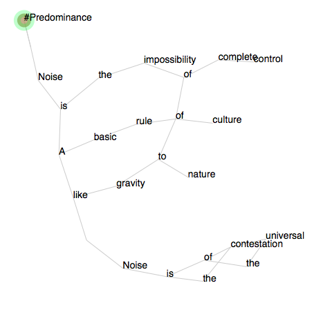
Figure 4: Eduardo Navas, #Predominance, two 2013 tweets rewritten as a poem, February 2015
I found that poems with longer lines took on a layout similar to their print counterparts, while poems that had more unconventional formats turned out more ambiguous. #Subaltern (figure 1) and #Abundance (figure 3) for instance, read very much like their corresponding print versions. Nevertheless, when each poem is launched, the first line could begin at the top or bottom of the page; also the layout could be reconfigured by dragging the circle with the mouse to any area. This offers some play with the layout of the words. And as it is well known, the layout of words is always of out most importance to poets.
#Standards (figure 2 ) and #Predominace (figure 4) offer more ambiguous layouts. Each poem may take longer to read given that the words are connected in ways that make sense to the corresponding print version, but due to D3’s random feature at initial launch in combination with its force feature, the reading of the lines turns out to be open-ended.
At this moment I have a set of tweets from the year 2014 that I am working on, which likely will be influenced by my awareness of the creative potential behind a force layout and a more conventional print layout. I’m not sure how the next set will turn out, but the experimentation with the years 2010 -13 is definitely informing the ongoing rewrites of tweets.