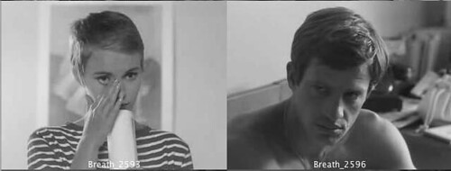
Figure1: Detail of hotel room scene of Godard’s Breathless (1960).
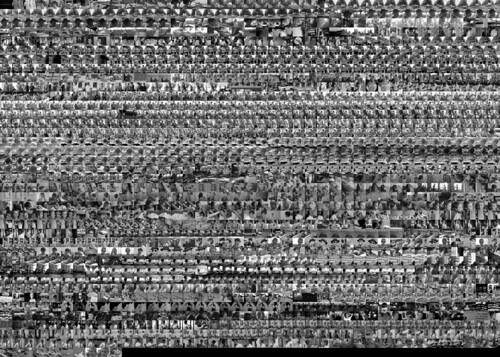
The image below is a grid-montage visualization of Godard’s Breathless. It was developed from a dutch-subtitled version of the film. I will be posting a detailed analysis in the future. In the mean time, this preliminary visualization is shared for research purposes as it may be of of use for anyone who wants to attain a general sense of the scene sequence, camera angles and frequency of shots throughout the film. I developed this and other visualizations (to be shared in the future) in order to teach film/video history, theory and editing in terms of art practice.

Figure 2: Actual grid-montage visualization of Godard’s Breathless (1960).
It should be noted that the frames of this visualization are not accurate to the actual shots. They were generated to attain a general sense of the scene sequence. Some important shots may be missing due to the fact that I exported in-out shots sensitive to major movement in the entire film, which then were sequenced in increments of three (which means that some in and out images are missing). The visualization is meant to provide an overall sense of the film’s development, not a detailed examination of the montage. This is crucial to keep in mind with a film such as Breathless, in particular, because of the importance of the jump cut.
More will be explained in a future and detailed post, which will include other visualizations and data analysis.