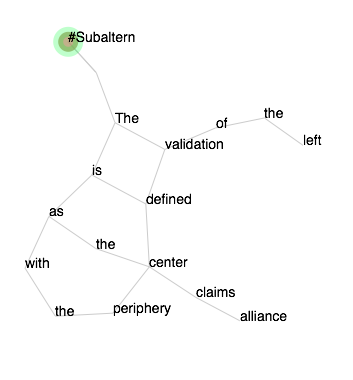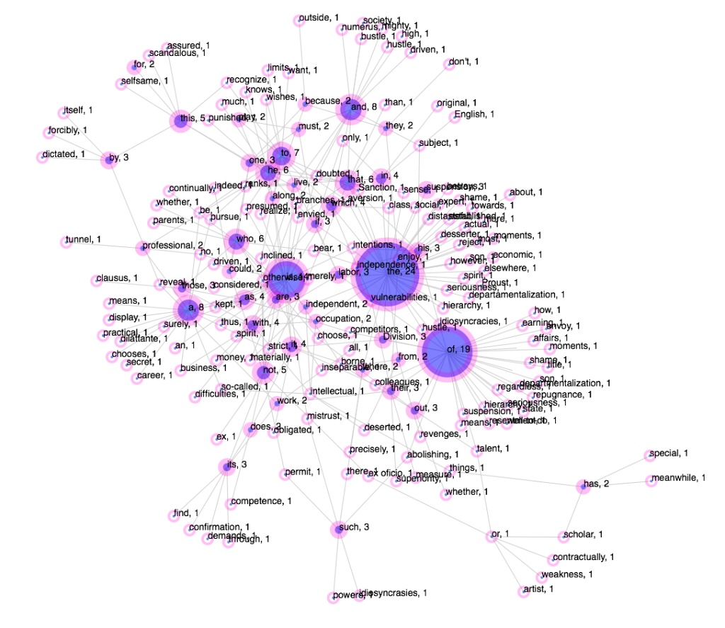
Figure 1: Overall view of a force layout visualization of Theodor Adorno’s Aphorism one, Minima Moralia, developed using D3, Eduardo Navas, February 2015.
Note: For the first post on Adorno’s text, see “Preliminary Notes on Analysis of Theodor Adorno’s Minima Moralia” part 1.
During the month of September of 2014, I began evaluating different types of visualization methods which could be used to examine the quantifiable relationship of image and text in closer relation to semantics. This can be a challenge for researchers who are using quantification to analyze visual and literary works, which in the past were solely evaluated with comparative methods relying on close readings of the subjects of interest.
My decision to develop D3 force layout visualizations of selected aphorisms of Theodor Adorno’s Minima Moralia came about in part due to extensive discussions on research methods I have been having since the beginning of the 2013 academic year with Graeme Sullivan, Director of the School of Visual Arts (SoVA) at Penn State. At one point Professor Sullivan wondered if a tool could be developed or repurposed that would show the relationship of different elements in clusters. He was interested in using such tool for studies in Art Education and related fields of research. I thought that, in my case, I could use it for visualizing different projects of my own.
In effect, I evaluated D3 and realized that its force layout features could be effective in developing visualizations for the multiple purposes I had been considering for over a year. In my case, this meant an in-depth understanding of Theodor Adorno’s writing for my project Minima Moralia Redux.
In what follows I explain how I will be implementing the D3 visualization template that I developed in order to write a critical analysis of Theodor Adorno’s Minima Moralia as part of my project Minima Moralia Redux. The visualization I share in this entry is the first of six that I will be developing in the next few months.
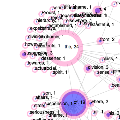
Figure 2: Visualization detail highlighting the number of recurrences of the article “the” throughout the text.
Prior to the force layouts, I had been using Many Eyes to visualize the importance of words in the aphorisms. [figure 5] These visualizations were not meant to provide a quantifiable presentation of the number of words, but rather offer at a glance an idea of how the aphorisms tended to have certain words repeat more than others, and consider this in relation to one’s reading of the actual text. It must also be kept in mind that Minima Moralia Redux is an actual artwork, so the quantification of information is used in part for aesthetic exploration. At the same time, I aim to develop a precise understanding of Adorno’s writing approach. One could argue that there are some limitations to my project given that I am only analyzing the English translations of Adorno’s book, not the German version. Nevertheless, doing the analysis of the English version available online in comparison to the official Verso English publication, in my view, is a valid pursuit, given that most people will be exposed to these versions of Adorno’s writing, due to the prevalence of English around the world. For this visualization, I used the online version of aphorism one.
The force layout is able to expose certain elements that a word cloud is not able to make evident. For one, it shows the recurrences of each word with its actual number. This was deliberate on my part. I could have shown only the word with a circle corresponding in size to the word’s recurrence. This means that , if I had not included the actual number of recurrences, in a way, the force layout would function similarly to the word cloud–by giving a somewhat abstract idea of the relation of words. But I decided to include the actual number of recurrences because I want the size of each circle to be equated with a specific number that can then be compared with other circles and numbers in the visualization. The connections among the words, in effect, are developed in relation to the recurrence of each word, which is interlinked to the words that come before and after. The result is a visualization that provides a sense of the actual relation of vocabulary to repetition, and how this might play a role in the argument of the text itself. what follows explains how this takes place.
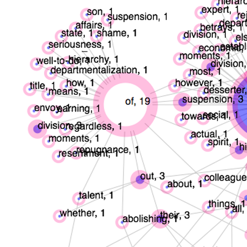
Figure 3: Visualization detail highlighting the number of recurrences of the preposition “of” throughout the text.
Word clouds show that the most common words will always be articles, prepositions, and common verbs. These are the binders in a sentence. Without them, we would not be able to communicate as we currently do. Many word clouds, such as the one available on Many Eyes and Wordle, omit common words. The results are visualizations that give a vague but decent sense of what the content may be about. What is not evident is how the vocabulary at play is enacted to make the argument effective.
With my implementation of a D3 force layout visualization, I aim to examine a few things about Adorno’s approach to critical writing. For one, the particular entry being examined here has three words that are mostly used, which are usually among the most common in all texts: “The” (24), “of” (19), and “is” (14). (See figures 2-4.) The number of words repeated after these diminishes drastically. Here is the list of the top ten words that recur more than once, which I extracted using Voyant:
the: 24
of: 19
is: 14
a: 8
and: 8
to: 7
he: 6
that: 6
who: 6
not:
For a complete list, access the text on Voyant.
The total number is 368 words and 212 unique words. It must be noted that not all the words in the text were visualized, only the words that repeated at least twice. This was done for the sake of simplicity. If all words had been included, the visualization would have been completely interconnected except for two words, because all the words would be linked to the terms that come before and after, thus creating a hard to read visualization.
What we have instead is a force layout that shows how the most repeated words bring together other words to develop a text that is dense in content but minimal in actual repetition. The first hint of this is the number of unique words, which is 212 out of 368–that’s roughly two thirds of the text is composed of unrepeated terms.
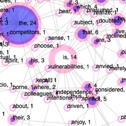
Figure 4: Visualization detail highlighting the number of recurrences of the verb “is” throughout the text.
Based on my assessment of this visualization in relation to the repeated and unique words, it appears that a text that makes use of a large vocabulary will show a few words that are used only when necessary to connect unique words. Meaning, an essay that is redundant will result with a greater number of large circles, differing from the visualization of aphorism one, as shown in this entry. The implication of this is that Adorno’s aphorism was carefully constructed, given that it would take great effort not to repeat words while trying to develop a complex argument. Trying not to repeat words for the sake of not repeating them would be an empty exercise, so it must be kept in mind that the high number of unique words comes at a rigorous process of selecting from a large vocabulary in order to produce the best argument possible.
This, however, does not automatically mean that a text with less unique words is not as effective, or unable to convey meaning. What can be assessed from this brief analysis is that Adorno took the time to think about the composition of his text, and that he did actually practice what he promoted in his critical writings. This could be perceived when a person reads the text, of course, but the numbers and visualization make this evident with concrete data. The entire premise of Minima Moralia, in fact, is to be critical of mindless recursion. Adorno believed that one should be wary of repetition as a regressive mode leading to passive thinking. As the force layout visualization shows, Adorno’s approach to life was implemented into the formal development of his work.

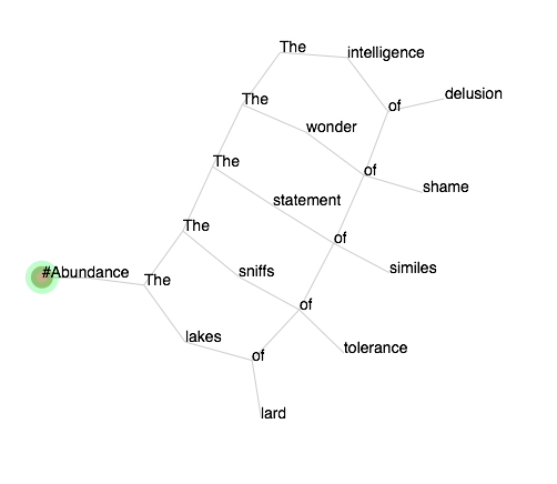
Figure 5: Word cloud of “For Marcel Proust” as visualized for Minima Moralia Redux, Aphorism 1 Remix.
There are more details that could be discussed about the relation of words to the actual content of the text, such as the numbers of the words to the actual message being conveyed. In this case, Adorno is reflecting on the importance of Proust, and Proust’s name is only mentioned once, as part of the title of the aphorism but never within the actual text. One would never be able to assess Adorno’s views on Proust by analyzing the visualization alone. This means that one must always be engaged with the actual text, and consider any type of visualization supplementary to the experience of the content. The quantification of data can be helpful only in verifying what one may perceive is at play within the aesthetic experience of a work of art. This, I find, appears to be a constant challenge to individuals who quantify data to evaluate aesthetics, which may appear like a paradox.
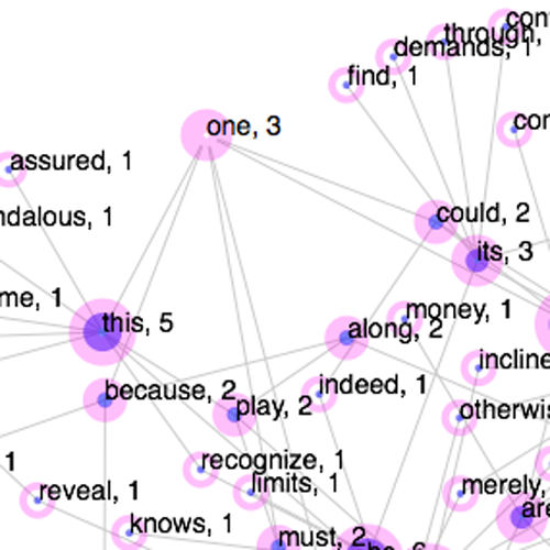
Figure 6: Visualization detail highlighting the number of recurrences of the word “one” throughout the text.
Others things that I will be evaluating once I visualize the remaining six aphorisms I have selected is how word usage may fluctuate from entry to entry over the development of the actual book and how this may relate to the number of unique and repeated words in relation to the overall focus of the work.
The potential of a D3 force visualization in terms of general use is to understand how the size of words or images (this type of visualization can be used for image data as well) can become an effective mapping tool, once a standardized relation of the nodes created are understood with a specific meaning consistently. In this case, this means that a few large number of circles versus a large number of small circles implies diversity in vocabulary. For this to happen, however, parts of the process need to be automated, so that the input of information is much faster.
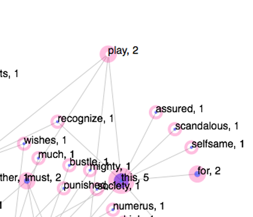
Figure 7: Visualization detail highlighting the number of recurrences of the word “play” throughout the text.